> ## Documentation Index
> Fetch the complete documentation index at: https://docs.costory.io/llms.txt
> Use this file to discover all available pages before exploring further.
# Dashboard Widgets and Chart Types
> Choose dashboard widgets and chart types for cloud cost dashboards, including bar charts, line charts, waterfall charts, doughnut charts, tables, KPI cards, budget trackers, and BigQuery SQL export.
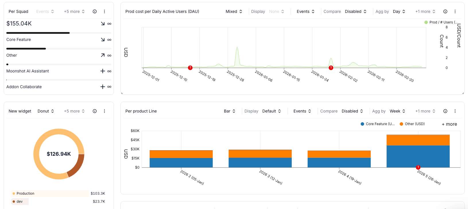
Dashboard widgets are saved cost views. Each widget can use Explorer-style metrics, formulas, filters, group-bys, comparison periods, and event context.
## Widget types
| Widget | Best for |
| -------------- | ----------------------------------------------------------------------------------------------- |
| Cost trend | Showing spend over time with a line, area, or bar chart |
| Cost breakdown | Showing how groups contribute to total spend by service, account, team, product, or environment |
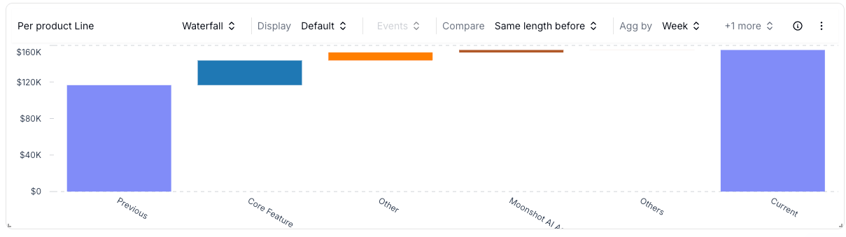
| Waterfall | Explaining which groups drove an increase or decrease between two periods |
| Doughnut | Showing the proportional split of a selected period |
| Table | Reviewing sortable cost data and exact values |
| KPI card | Displaying one number, such as total spend, cost per user, or Savings Plan coverage |
| Budget tracker | Comparing actual spend with a [budget](/features/budgets) target |
## Chart types
Choose the chart type based on the question the widget should answer.
 | Chart type | Use it when |
| --------------- | -------------------------------------------------------------------------------------------- |
| Bar chart | You need to compare grouped spend over time and see how each group contributes to the total. |
| Line chart | You need to compare trends across services, teams, or providers. |
| Area chart | You need a trend view that emphasizes total spend volume. |
| Doughnut chart | You need a proportional split for one period, such as spend by provider or team. |
| Waterfall chart | You need to explain what changed between the selected period and the reference period. |
| Table | You need exact values, sorting, or a top-cost breakdown. |
## Waterfall charts
Waterfall charts show which services, accounts, teams, or products drove a cost increase or decrease between two periods. Use them during budget reviews, migration reviews, and cost-change explanations.
| Chart type | Use it when |
| --------------- | -------------------------------------------------------------------------------------------- |
| Bar chart | You need to compare grouped spend over time and see how each group contributes to the total. |
| Line chart | You need to compare trends across services, teams, or providers. |
| Area chart | You need a trend view that emphasizes total spend volume. |
| Doughnut chart | You need a proportional split for one period, such as spend by provider or team. |
| Waterfall chart | You need to explain what changed between the selected period and the reference period. |
| Table | You need exact values, sorting, or a top-cost breakdown. |
## Waterfall charts
Waterfall charts show which services, accounts, teams, or products drove a cost increase or decrease between two periods. Use them during budget reviews, migration reviews, and cost-change explanations.
 Pair waterfall charts with [events](/features/events) when you need to explain whether a deploy, migration, purchase, or business change happened near the cost movement.
## Doughnut charts
Doughnut charts show proportional spend for a selected period. Use them for high-level split views such as cost by provider, business unit, environment, or product.
## Tables
Table widgets show the data behind a chart. Use them when reviewers need exact values, sorting, or exportable cost breakdowns.
Tables can include:
* Selected-period cost
* Reference-period cost when comparison is enabled
* Absolute change
* Relative change
* Cost, usage, budget, or formula values
## Budget vs actual widgets
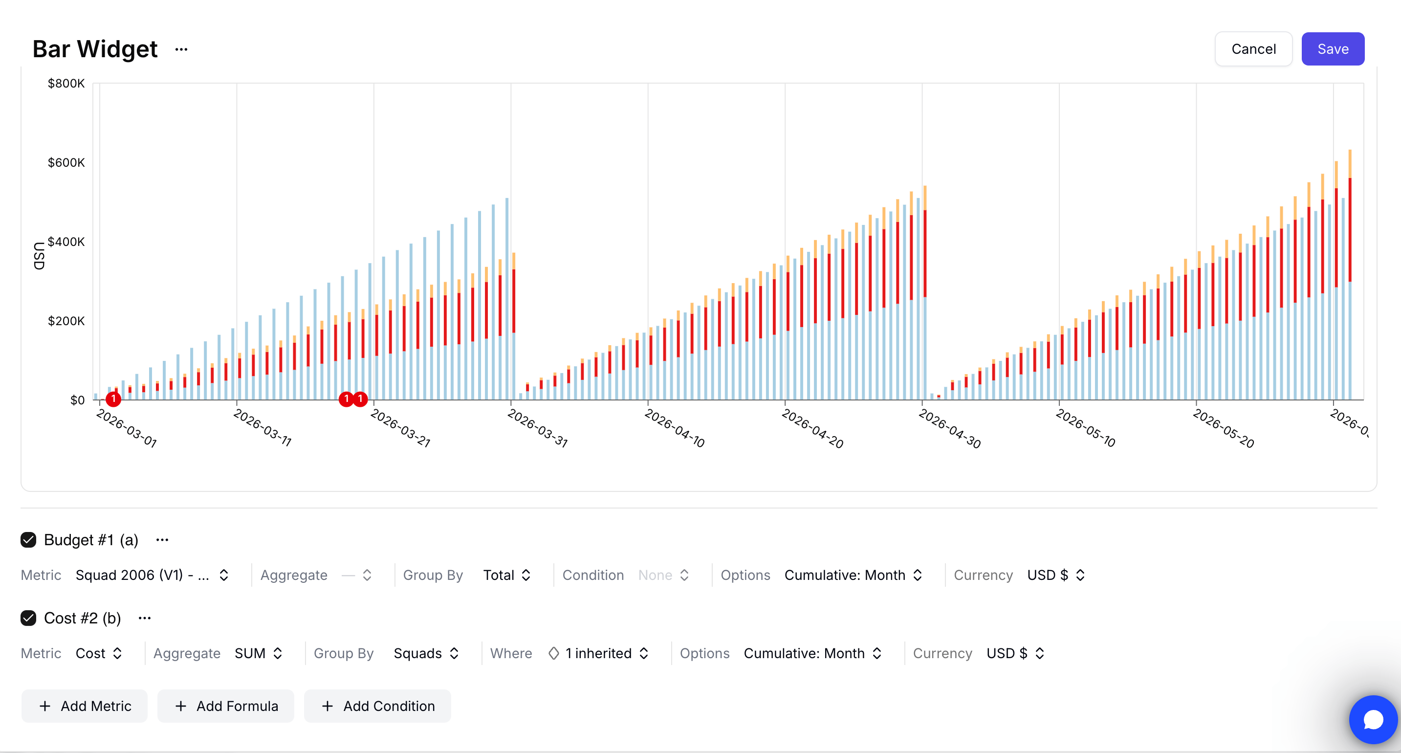
Use a budget widget when you want to compare an approved [budget](/features/budgets) with actual spend.
Open the dashboard, click the widget action menu, and select **Edit widget**.
Click **Add Metric**, open the **budget** tab, and choose the budget version you want to analyze.
Open the action menu for the budget metric and click **Add related cost**. Costory adds a cost metric scoped to the budget definition.
Set **Group By** on the related cost metric to the dimension you use for ownership, such as team, squad, or product line.
Click **Save**.
Pair waterfall charts with [events](/features/events) when you need to explain whether a deploy, migration, purchase, or business change happened near the cost movement.
## Doughnut charts
Doughnut charts show proportional spend for a selected period. Use them for high-level split views such as cost by provider, business unit, environment, or product.
## Tables
Table widgets show the data behind a chart. Use them when reviewers need exact values, sorting, or exportable cost breakdowns.
Tables can include:
* Selected-period cost
* Reference-period cost when comparison is enabled
* Absolute change
* Relative change
* Cost, usage, budget, or formula values
## Budget vs actual widgets
Use a budget widget when you want to compare an approved [budget](/features/budgets) with actual spend.
Open the dashboard, click the widget action menu, and select **Edit widget**.
Click **Add Metric**, open the **budget** tab, and choose the budget version you want to analyze.
Open the action menu for the budget metric and click **Add related cost**. Costory adds a cost metric scoped to the budget definition.
Set **Group By** on the related cost metric to the dimension you use for ownership, such as team, squad, or product line.
Click **Save**.
 ## Color palettes
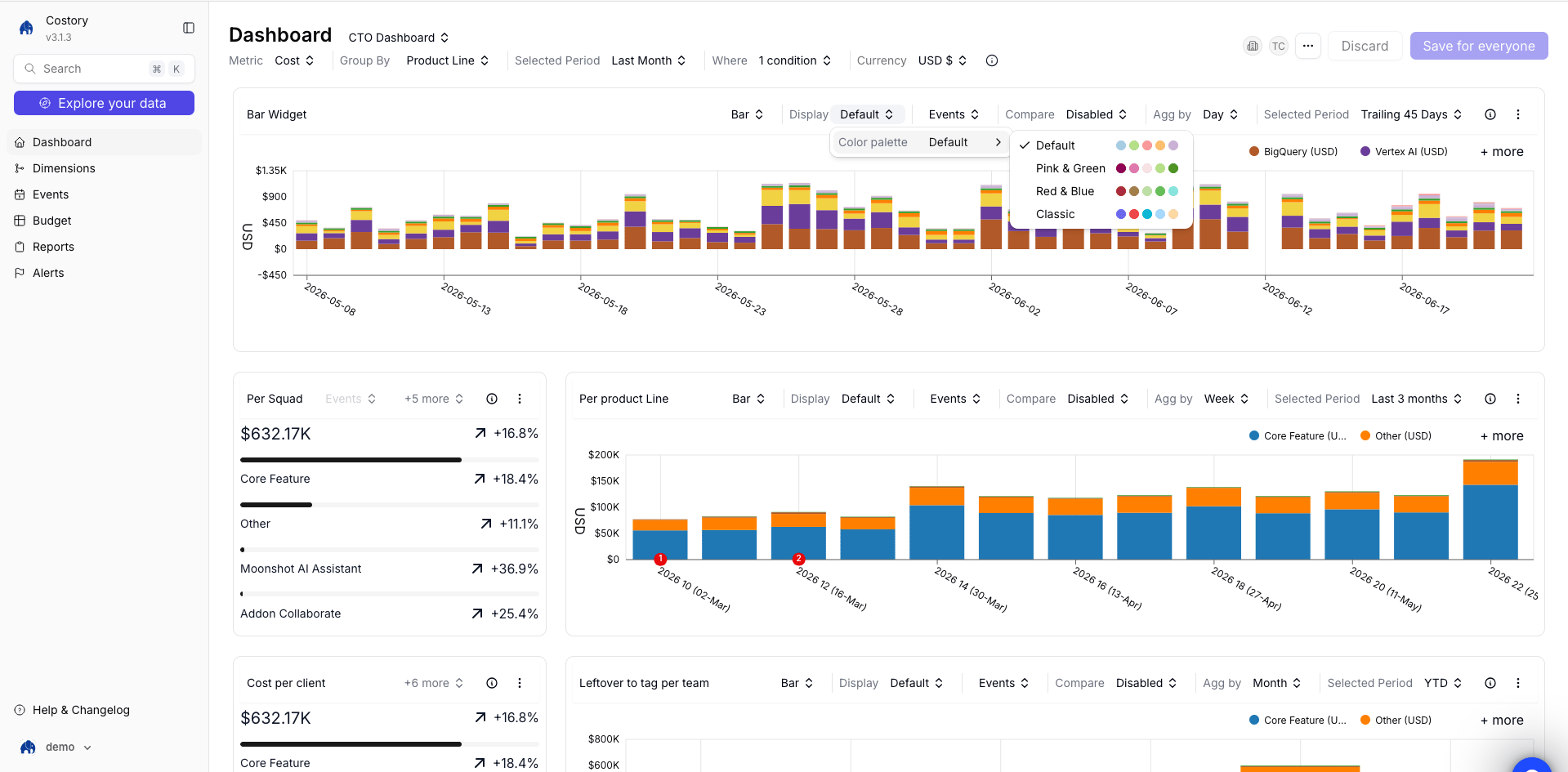
Each chart widget can use one of four color palettes. Switch palettes to keep visuals readable across stacked bars, line charts, and grouped breakdowns. The setting lives in the widget editor's chart display options.
## Color palettes
Each chart widget can use one of four color palettes. Switch palettes to keep visuals readable across stacked bars, line charts, and grouped breakdowns. The setting lives in the widget editor's chart display options.
 ## Export widget SQL to BigQuery
BigQuery data exports let you query the same cost data shown in a dashboard widget from your own BigQuery project. Use this when you want to reuse dashboard logic in Looker, notebooks, dbt, or custom SQL without rebuilding filters.
## Export widget SQL to BigQuery
BigQuery data exports let you query the same cost data shown in a dashboard widget from your own BigQuery project. Use this when you want to reuse dashboard logic in Looker, notebooks, dbt, or custom SQL without rebuilding filters.
 Ask an **Organization Admin** to grant your BigQuery user or service account read access to the Costory export table under **Integrations > Destinations**. See [BigQuery Data Exports](/setup/destinations/bigquery) for setup.
Open the dashboard that contains the widget you want to query outside Costory.
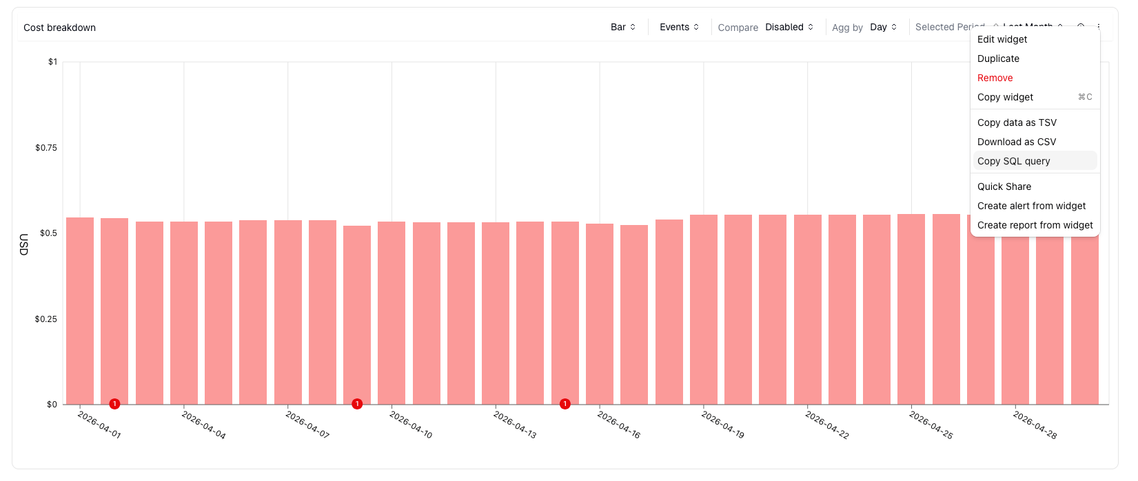
Open the widget action menu and click **Copy SQL query**.
Paste the SQL into BigQuery, Looker, or a notebook that can query BigQuery.
The copied SQL reflects the widget configuration, including metric, filters, group-by, and date range.
## Related links
Add widgets to dashboards and organize them for teams.
Start with pre-built FinOps widgets.
Add usage metrics and formulas to the queries behind widgets.
Set up the destination used by SQL export.
Ask an **Organization Admin** to grant your BigQuery user or service account read access to the Costory export table under **Integrations > Destinations**. See [BigQuery Data Exports](/setup/destinations/bigquery) for setup.
Open the dashboard that contains the widget you want to query outside Costory.
Open the widget action menu and click **Copy SQL query**.
Paste the SQL into BigQuery, Looker, or a notebook that can query BigQuery.
The copied SQL reflects the widget configuration, including metric, filters, group-by, and date range.
## Related links
Add widgets to dashboards and organize them for teams.
Start with pre-built FinOps widgets.
Add usage metrics and formulas to the queries behind widgets.
Set up the destination used by SQL export.