Where clause, group spend by the right dimension, compare periods, and decide what should happen next.
Overview
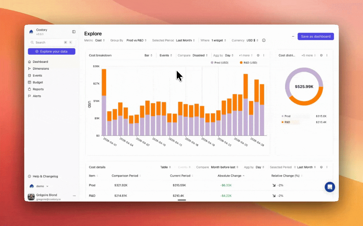
Explorer is built for investigation. You start with a cost question, refine the query, and use the result as context for another workflow. Most teams use Explorer to:- Identify which service, account, region, team, resource, or dimension explains a cost change
- Compare the selected period with a reference period to understand absolute and relative movement
- Combine cost metrics, usage metrics, and formulas for unit economics analysis
- Save the query as a dashboard widget, alert, report, or context for the FinOps MCP
Build a cost query
The query bar controls what data Explorer returns.What to do with the result
Explorer is often the starting point for a recurring workflow.Create a dashboard
Turn a useful query into a persistent dashboard widget.
Create an alert
Monitor the same cost surface and notify owners when a condition is met.
Schedule a Cost Report
Send a recurring snapshot to Slack, Microsoft Teams, or email.
Continue in MCP
Copy the query context into Claude, Cursor, VS Code, or Dust through the FinOps MCP.
Frequently asked questions
Which cloud providers does Explorer support?
Which cloud providers does Explorer support?
Can I save an Explorer query?
Can I save an Explorer query?
Yes. Save the query as a dashboard widget when you want a recurring view, or use it as the basis for an alert or scheduled Cost Report.
Can I combine costs with business metrics?
Can I combine costs with business metrics?
Yes. Add usage metrics and formulas in Explorer to calculate ratios such as cost per user or cost per transaction. See Unit Economics for the full workflow.
How fresh is the data?
How fresh is the data?
Costory processes cloud billing data daily, typically within 24 hours of your cloud provider publishing it. See Data Refresh for details.
Related links
Dashboards
Build persistent views from Explorer queries.
Unit Economics
Add metrics and formulas to cost analysis.
FinOps MCP
Query Costory data and create FinOps workflows from an AI assistant.
Cost Reports
Deliver recurring cost snapshots to Slack, Teams, or email.