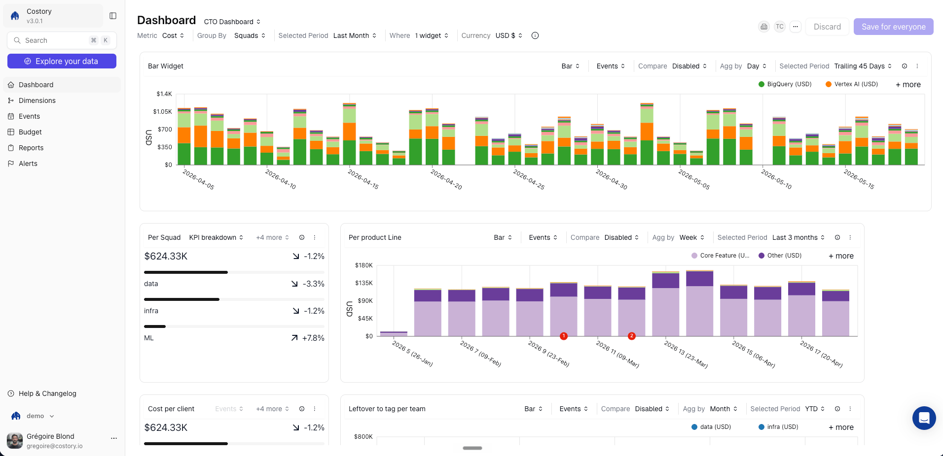
Cloud cost dashboards replace the scattered mix of billing consoles, spreadsheets, and monitoring tools with a single, persistent view. Combine cloud costs, , budgets, and events on one canvas so your team always has the full picture of cloud spend.
Costory CTO dashboard with cost trend, budget tracker, and service breakdown widgets

Prerequisites

  • At least one cloud provider (AWS, GCP, or Azure) connected to Costory
  • (Optional) Virtual Dimensions configured for team-level or product-level groupings
  • (Optional) Usage metrics connected for unit economics widgets (Datadog, Amplitude, BigQuery, etc.)
  • (Optional) Teams configured for team-level scopes.

Overview

A dashboard is a canvas of widgets, each backed by its own cost query. A saved Cost Explorer view is a single query configuration. A dashboard combines multiple views on the same page: a cost trend next to a budget gauge next to a top-5-services table. Where dashboards fit in your day-to-day:
  • Give each team a persistent view of their own spend with and dashboards scoped by Virtual Dimensions
  • Share high-level views with leadership that include cost trends, budget tracking, and top cost drivers, without requiring them to learn the Cost Explorer interface
  • Track coverage, unit economics, and Kubernetes waste KPIs in one place
  • Combine cost data with usage metrics and events on the same canvas to understand why costs changed

Creating a dashboard

From a template

Costory ships pre-built dashboard templates for common FinOps scenarios so you don’t have to start from scratch.
Costory dashboard template gallery showing pre-built FinOps dashboards
Available templates include:
  • CTO / Executive overview: total spend trend, top cost drivers, budget progress, and month-over-month comparison
  • Savings Plan & CUD coverage: utilization rates, covered vs. uncovered spend, and coverage trends over time
  • Kubernetes cost breakdown: cost by namespace, workload, and waste ratio
  • Team cost overview: per-team spend scoped by Virtual Dimension, with period comparison
To apply a template, navigate to Dashboards, click Create Dashboard, and select a template. Costory pre-fills the widgets with your connected billing data. You can customize any widget after creation.

Add a widget manually

Add a widget manually to a dashboard
1

Open a dashboard

Navigate to an existing dashboard or create a new one.
2

Add a widget

Click Add Widget and choose a widget type from the list below.
3

Configure the query

Select the cost metric, filters, group-bys, and visualization. You can use any dimension available in Cost Explorer, including and custom formulas.
4

Save

Click Save. The widget is live and updates with each data refresh.
You can also export any query from Cost Explorer directly to a dashboard by clicking Export > Dashboard. This is the fastest way to turn an ad-hoc investigation into a permanent widget.
You can also duplicate an existing widget and adjust its filters to quickly build variations, for example the same cost trend scoped to different teams or services.
Duplicating a dashboard widget in Costory

Widget types

WidgetDescription
Cost trendLine or bar chart showing cost over time, with optional period comparison
Cost breakdownStacked bar or pie chart grouped by any dimension (service, account, team, etc.)
Budget trackerProgress bar showing actual spend vs. target
Single valueBig number displaying a KPI: total spend, cost per user, Savings Plan coverage %
TableTabular cost data with sorting and filtering, useful for top-N breakdowns
WaterfallVisualize which services, accounts, or teams drove a cost increase or decrease between two periods

Showback and chargeback use cases

Dashboards are the foundation of (informational cost visibility) and (allocating costs to internal budgets). Before building a dashboard, you need the underlying cost allocation in place.

Allocate costs to any dimension

Dashboard widgets can group costs by any dimension available in Costory. To enable team-level, product-level, or business-unit groupings, configure Costory’s tagging pipeline first: Virtual Dimensions for rule-based groupings, Feature Engineering for tag cleanup, and Shared Cost Allocation for splitting shared infrastructure. Once configured, those dimensions are available in every widget automatically.

Build showback dashboards

A showback dashboard gives a team or business unit a self-service view of their cloud spend. A typical setup follows this pattern:
  1. Filter by Virtual Dimension: scope all widgets to a specific team or product using the Virtual Dimensions you’ve configured
  2. Include allocated costs: add widgets that show costs from Shared Cost Allocation so the team sees the full picture, including their share of shared infrastructure
  3. Add usage metrics for context: place cost-per-user or cost-per-transaction widgets alongside raw spend so teams can assess efficiency, not just total cost
  4. Pair with alerts: set up cost alerts on the same dimensions so teams get notified when their spend crosses a threshold
Start with one team dashboard and iterate. Once the layout works, duplicate it and swap the Virtual Dimension filter to create dashboards for other teams.

Example: Team cost dashboard

A typical team-level dashboard includes:
  • Cost trend by service: a line chart filtered to the team’s , grouped by cloud service, with a month-over-month comparison
  • Budget progress: a progress bar showing how much of the team’s monthly budget has been consumed
  • Top 5 cost drivers: a table widget showing the five services or resources with the highest spend
  • Savings Plan coverage: a single-value widget displaying the team’s current coverage ratio
  • Cost per active user: a custom formula widget dividing cloud spend by DAU from an external usage metric
  • Deploy events overlay: cost trend annotated with GitHub deploy events so the team can correlate cost changes with releases
This combination gives the team everything they need (spend trends, budget status, efficiency metrics, and operational context) without leaving a single page. You can create this dashboard once and apply a scope per team using Teams to filter down the cost for each team.
Costory dashboard list showing team-owned dashboards with descriptions and labels

Sharing and collaboration

  • Every dashboard has a unique URL you can send to teammates or stakeholders.
  • Deliver a dashboard summary to Slack, Microsoft Teams, or email on a recurring schedule using Slack Reports.
  • Assign dashboards to a Team so all members see them by default. Public dashboards are visible org-wide; private dashboards are restricted to team members.
  • Schedule a single dashboard to be delivered to multiple team owners, each receiving their own scoped version filtered to their team’s perimeter. One dashboard template, many personalized reports.
Costory templated destinations sending scoped dashboard reports to team owners
  • Collaborate in real time: all team members can add, edit, and rearrange widgets on dashboards assigned to their team

Frequently Asked Questions

Yes. Any widget can use a custom formula that combines cost metrics with usage metrics. For example, you can place a cost trend widget next to a cost-per-DAU widget on the same dashboard to track both spend and efficiency.
Dashboards reflect the latest data from your billing providers. Costory ingests new data daily (or twice daily depending on your plan), and dashboards update automatically. See the data refresh documentation for details.
Yes. Combine Virtual Dimensions for team-level cost allocation with budget tracker widgets and scheduled Slack Reports to build a full chargeback workflow. For shared costs, use Shared Cost Allocation to split infrastructure costs based on actual usage.
It depends on the dashboard’s visibility. Public dashboards are visible to everyone in your Costory organization. Private dashboards, assigned to a Team, are only visible to team members. See Teams for details on visibility settings.

Next Steps

Cost Explorer

Build the queries that power your dashboard widgets

Slack Reports

Schedule dashboard snapshots to Slack, Teams, or email

Virtual Dimensions

Create team-level and product-level cost groupings

Budgets

Set spending targets and track progress on dashboards

Alerts

Get notified when dashboard KPIs cross a threshold

Executive Cost Reports

Build the views your leadership team wants to see
Last modified on March 18, 2026