Your AWS bill spiked 30% last week. Was it that deploy on Tuesday, or something else? overlays deploys, purchases, and custom events directly on your cost charts so you can answer that question in seconds. Custom metrics let you go further: divide cost by usage to track efficiency over time, not just total spend.Documentation Index
Fetch the complete documentation index at: https://docs.costory.io/llms.txt
Use this file to discover all available pages before exploring further.
| Question | Capability | Example |
|---|---|---|
| What changed? | Cost Explorer | ”EC2 spend increased 30% last week” |
| Why did it change? | Event correlation | ”A deploy on March 5th added a new batch job” |
| Does it matter? | ”Cost per active user still dropped 12%“ | |
| Who should know? | Digest / Reports | ”AI summary sent to #cloud-costs in Slack” |
Event correlation
Overlay technical and business events directly on your cost charts to spot the cause of cost changes at a glance, without switching between your billing console, CI/CD tool, and Slack threads.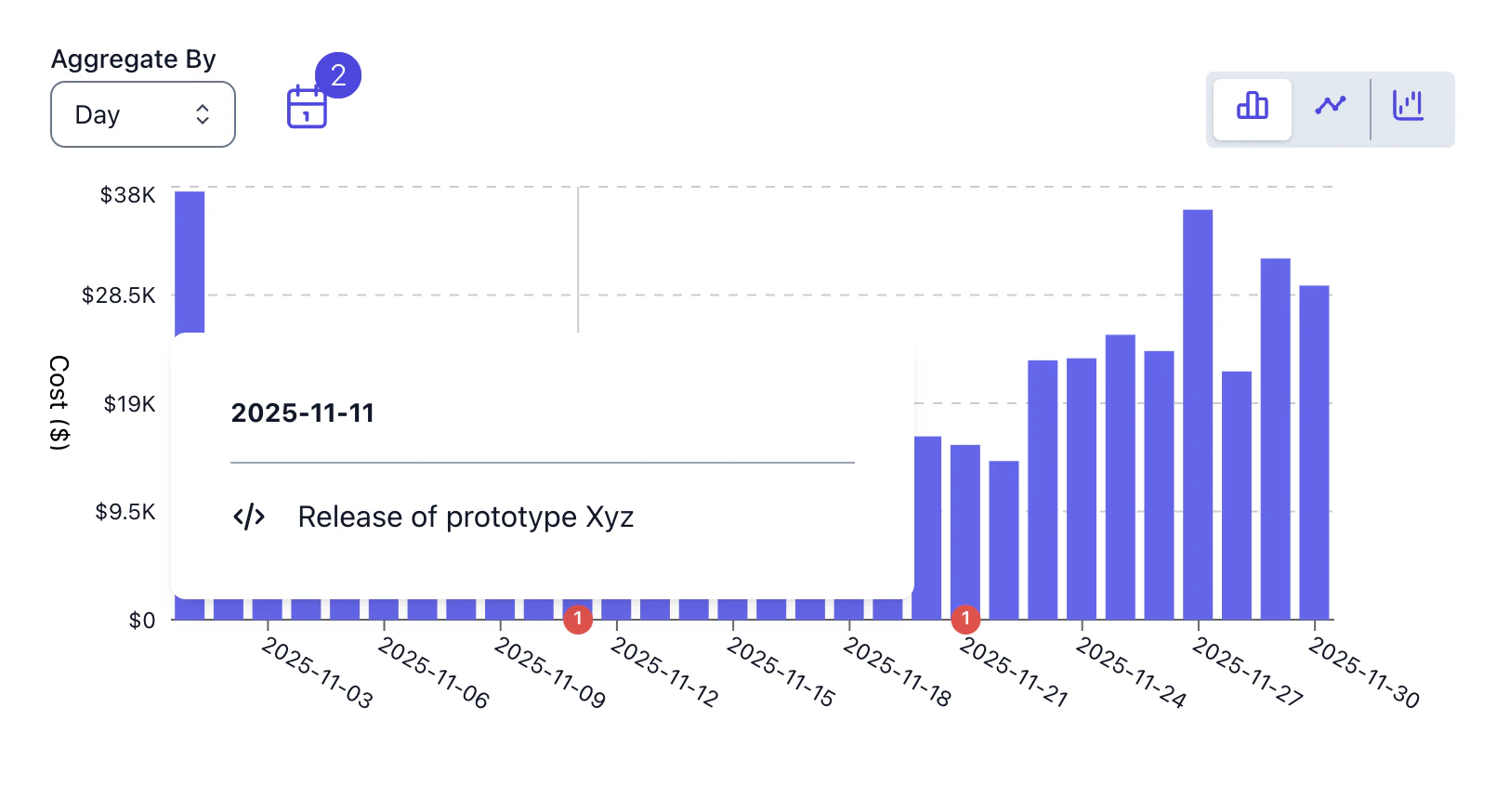
When to use event correlation
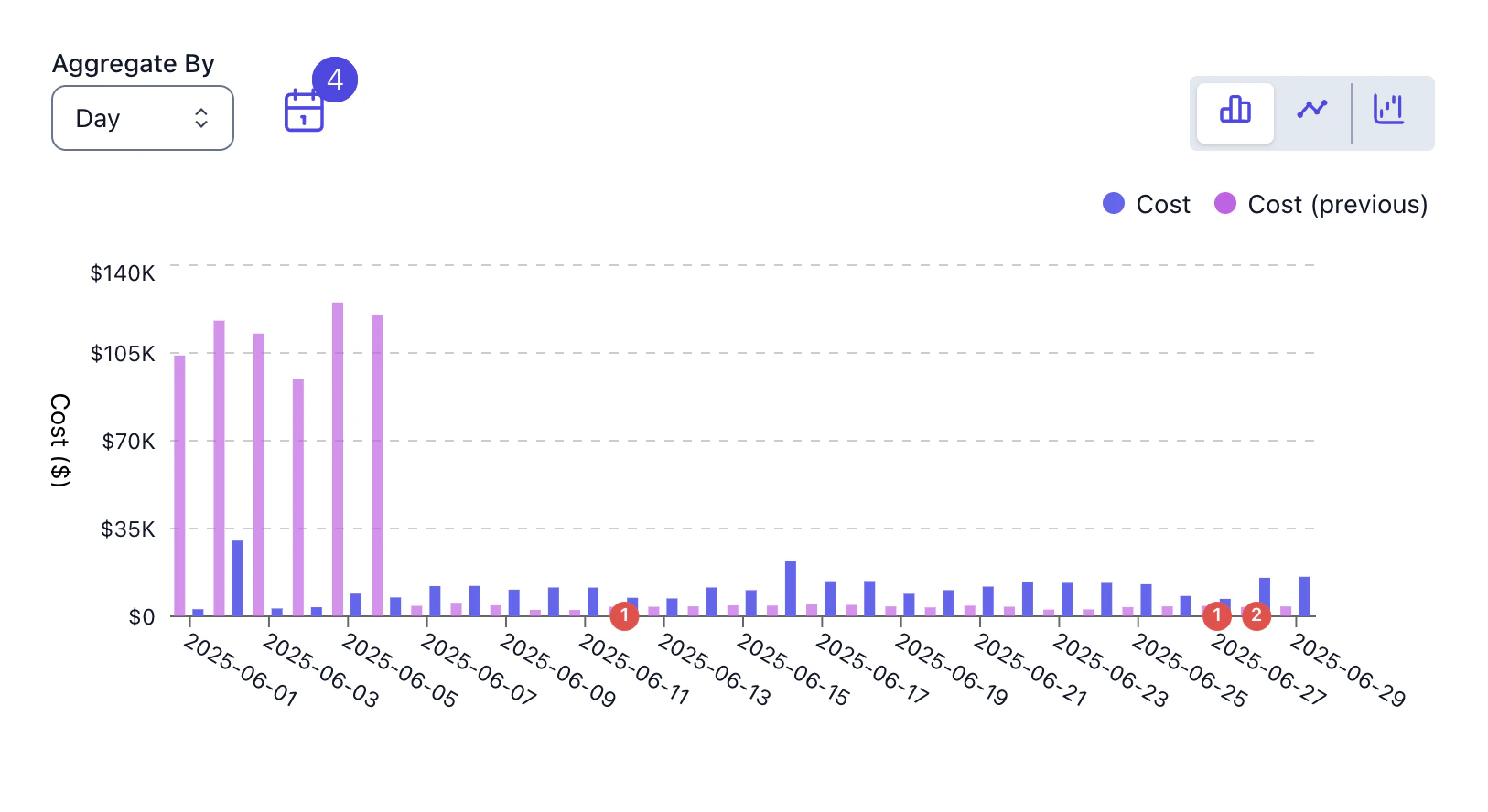
- You see a sudden increase in EC2 spend that lines up with a deploy marker. Click the event to see which PR was merged and what it changed.
- A purchase event appears on the chart, letting you verify the cost line drops as expected in the following days.
- Attach event overlays to a saved view so colleagues see why costs changed, not just that they changed.
- During an outage or cost anomaly, event markers help you quickly rule in or rule out recent deploys or infrastructure changes.
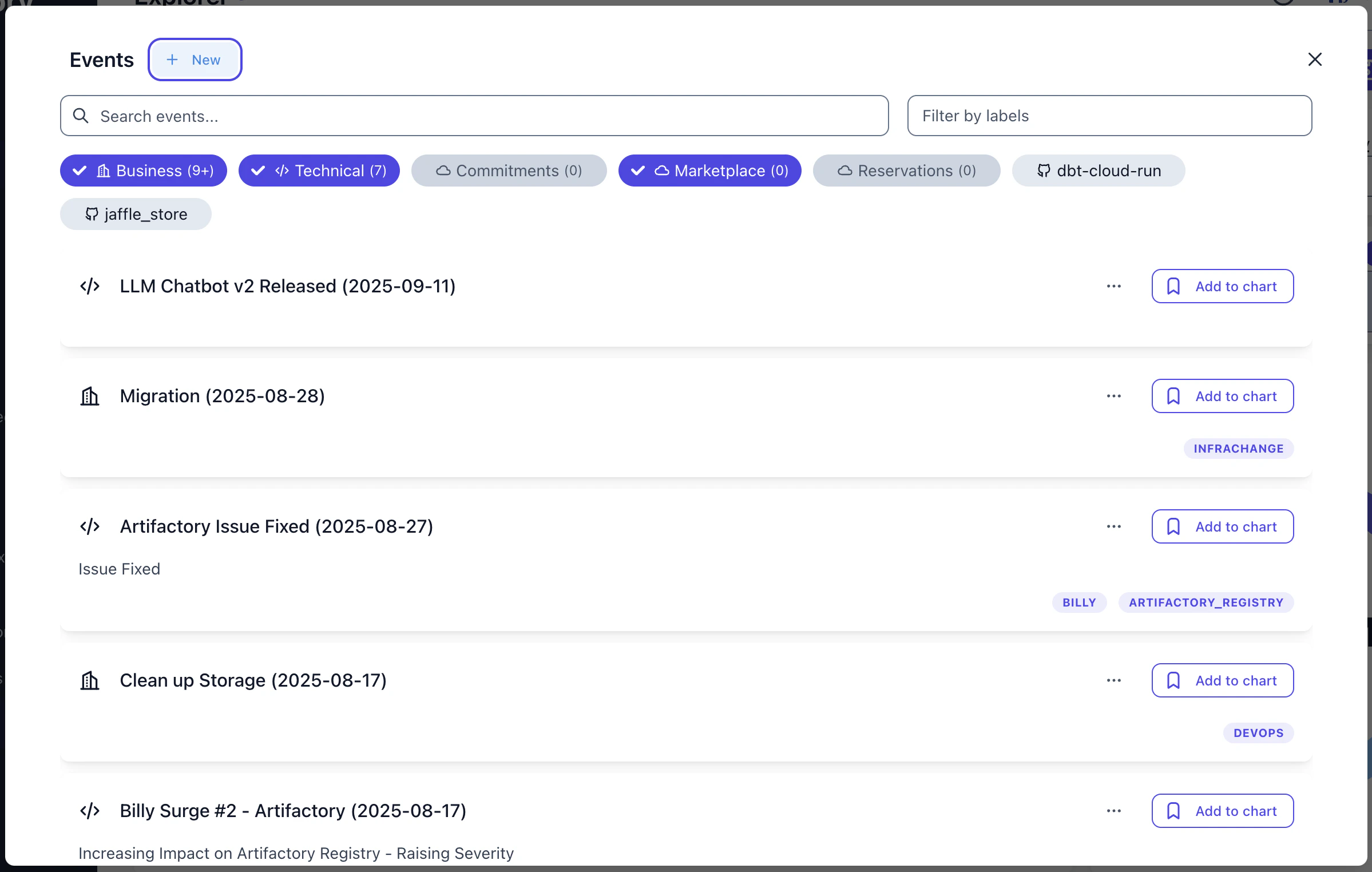
Supported event types
Costory groups events into categories you can toggle independently:- Cloud provider events: purchases, CUD activations, marketplace renewals, detected automatically from your billing data
- Technical events: GitHub pull requests merged, production deploys, CI/CD pipeline events
- Business events: custom events you push via the public API, such as feature launches, marketing campaigns, pricing changes, or anything relevant to cost
How to use event correlation
Open Cost Explorer
Navigate to Cost Explorer and build your query.
Enable event overlays
Click Show Events in the toolbar. The Events panel opens, showing all available events grouped by category. Toggle categories on or off, or add individual events to the chart.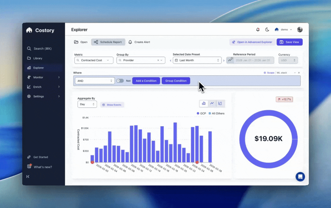
Example: investigating a cost spike after a deploy
Imagine your weekly EC2 bill jumped 30% starting March 5th. Here’s how event correlation helps:- Open Cost Explorer and filter to EC2 costs for the past two weeks. You see the spike clearly in the chart.
- Enable GitHub events. A deploy marker appears on March 5th, the same day the spike started.
- Click the event to see that PR #1234 was merged: “Add nightly batch processing job for ML model retraining.”
- Root cause identified: the new batch job runs large GPU instances every night. You can now decide whether to optimize instance types, adjust scheduling, or accept the cost.
Attach events to saved views
You can attach event overlays to saved views so the context travels with the data when you share it with your team. When a colleague opens the view or receives it as a scheduled report, they see both the cost data and the events that explain it.Managing events
The Events page gives you a central view of all events across your organization. You can search, filter by source or tag, and manually create events for milestones that don’t come from an integration (e.g., “Q1 pricing change” or “data center migration started”).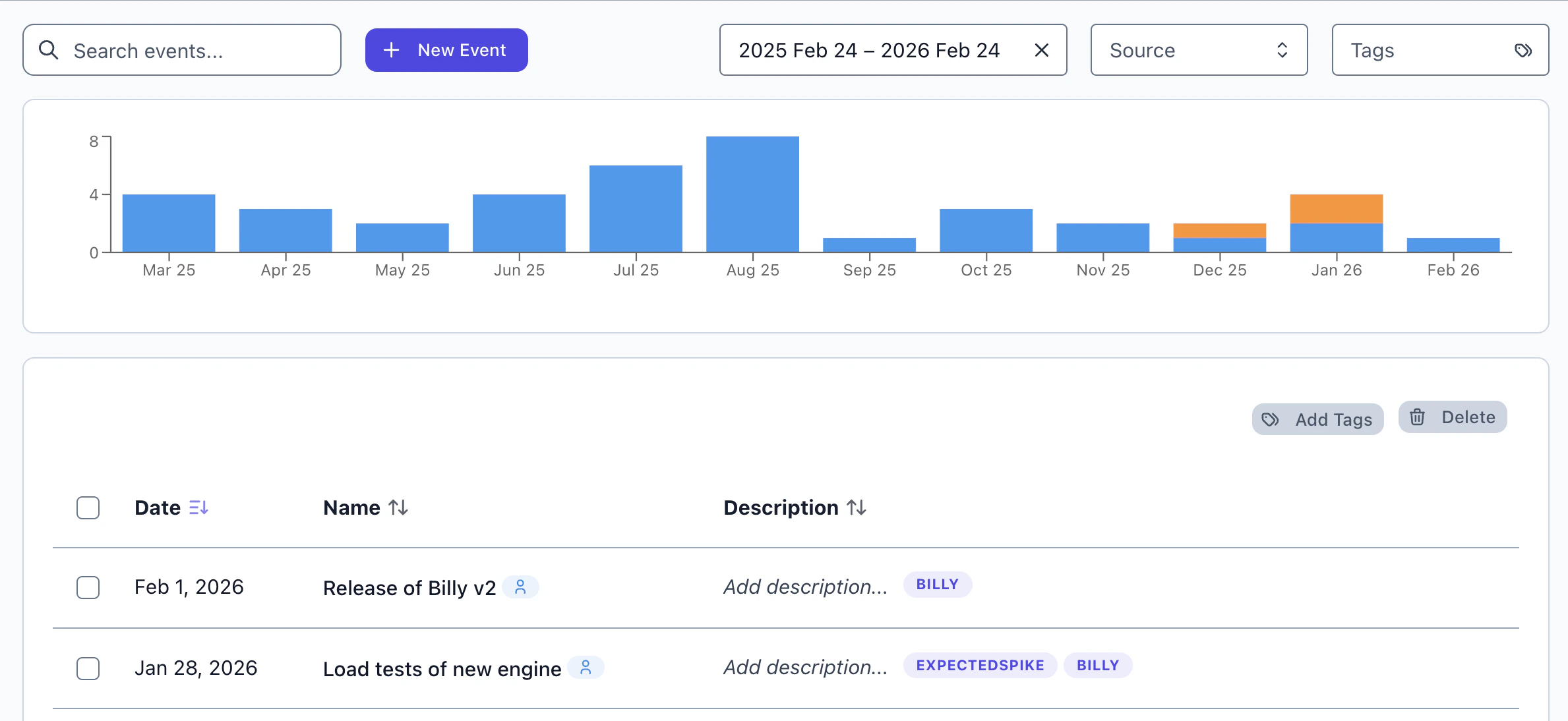
Setting up event sources
To overlay events in Cost Explorer, you need at least one event source connected:GitHub
Deploys and PR merges
CI/CD
Pipeline events
Custom API
Push any event
Unit economics and custom metrics
Define formulas to track cost efficiency alongside raw spend. Instead of only seeing “we spent $50k on compute,” you can answer “our cost per daily active user dropped 12% this month.”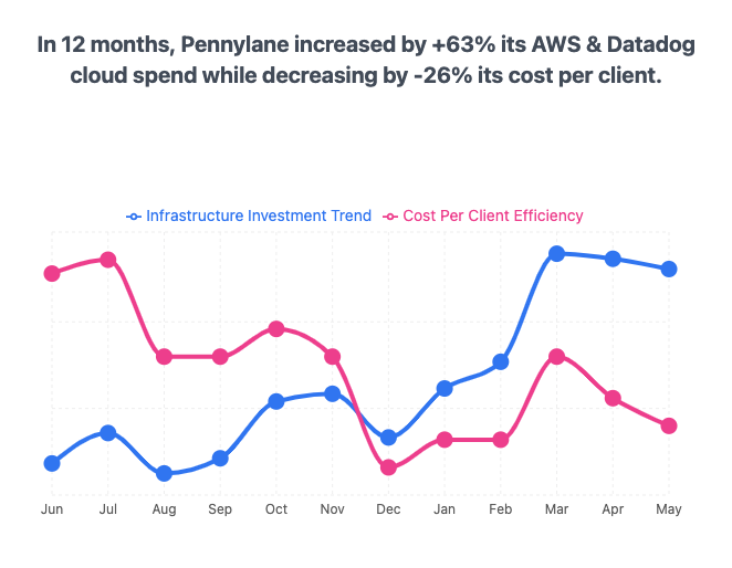
What you can build
- Track infrastructure unit economics like cost per GB transferred, cost per build minute, or cost per container-hour by dividing cloud spend by usage metrics from your billing data or from sources like Datadog.
- Track application unit economics like cost per API call, cost per DAU, or cost per transaction by connecting external metrics from Amplitude, BigQuery, or CSV. See the Cost Per Active User guide for a step-by-step example.
- Compare the cost of a new service against the one it replaced by grouping formulas by service tag and tracking the trend over time.
- Track realized savings from or CUDs by computing
list_cost - total_cost. - Build custom KPIs for Savings Plan and CUD utilization rates.
Available metric types
Costory’s query bar supports four types of metrics you can combine in formulas:- Cost metrics
- Usage metrics
- External metrics
Built-in billing metrics from your connected cloud providers. These are always available and include fields like total cost, , list cost, and usage quantity.
Prerequisites
To build unit economics formulas, you need at least one usage metric source connected to Costory. Supported sources include:- Datadog for infrastructure and application metrics
- Amplitude for product analytics (DAU, MAU, sessions)
- BigQuery for warehouse-native metrics
- CSV or Google Sheets for manual data imports
You don’t need external metrics to use formulas. You can combine cost fields with usage metrics from your billing data (e.g., cost per GB-Hour) without connecting any external source.
Creating a custom formula
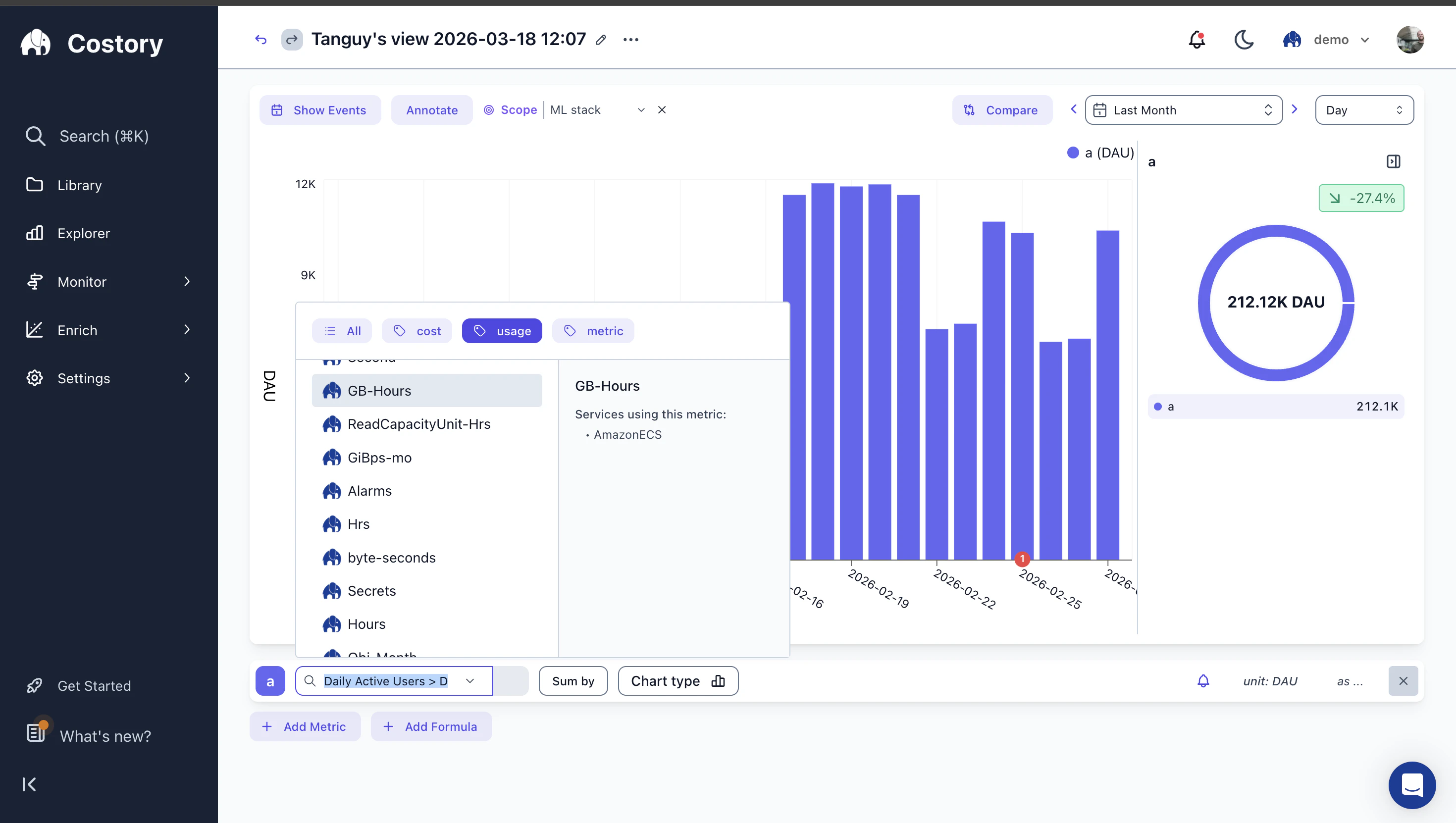
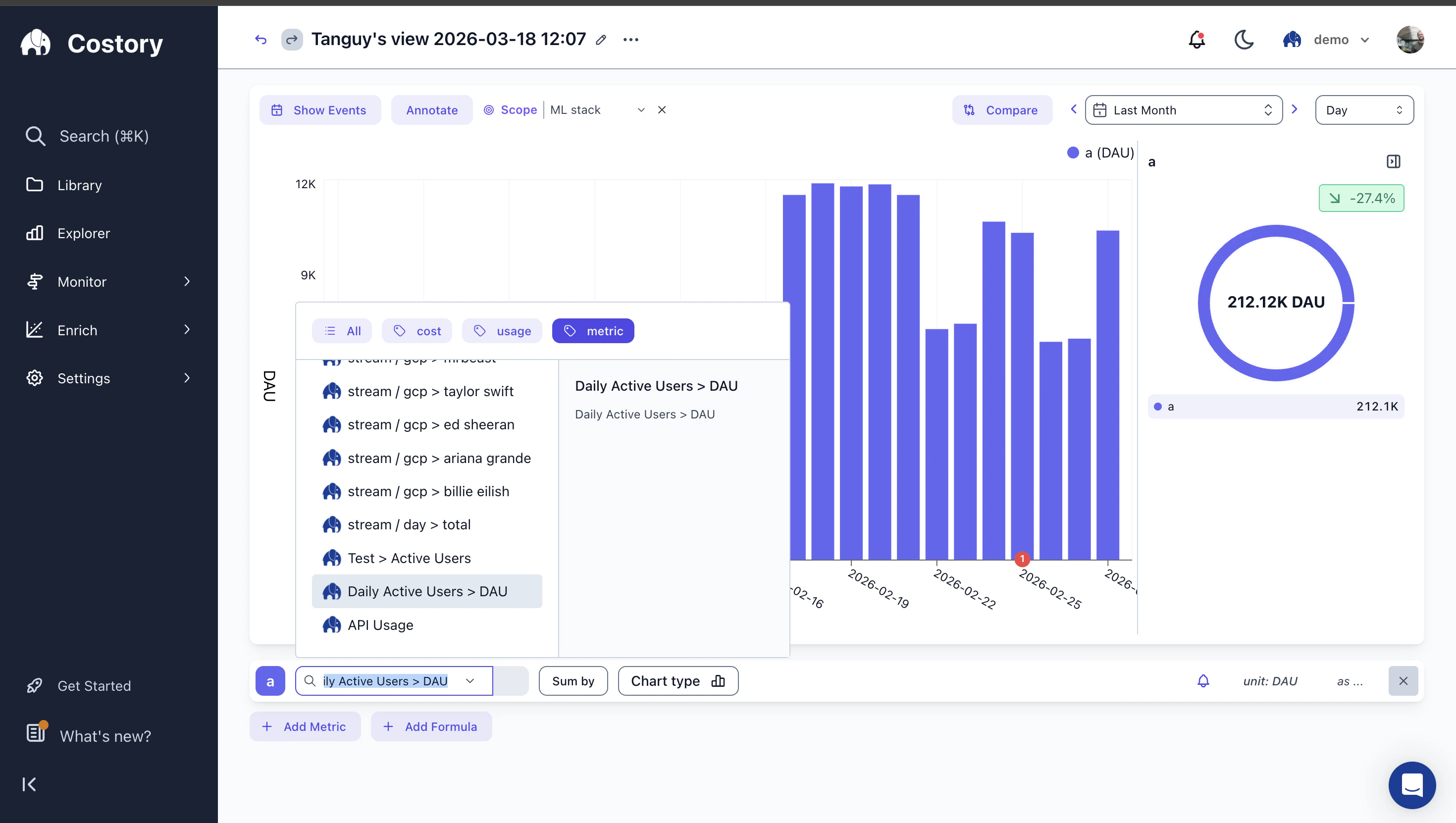
Open Cost Explorer
Navigate to Cost Explorer and configure your base cost query.
Add metrics
Click + Add Metric in the query bar to add a cost metric or an external metric. Each metric gets a letter label (a, b, c…) that you reference in formulas.
Add a formula
Click + Add Formula. Write your formula using the letter labels. For example: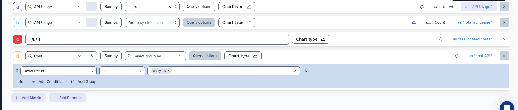
- If metric a is total cost and metric b is GB-Hours:
a / bgives you cost per GB-Hour - If metric a is total cost and metric b is Daily Active Users:
a / bgives you cost per DAU
Formulas currently support
+, -, *, /, and parentheses. For more complex transformations (rolling averages, conditionals), pre-compute the metric in your source system before importing.Visualize the result
The chart updates to show your formula result over time. You can switch between chart types (bar, line) and toggle between the raw metrics and the formula output.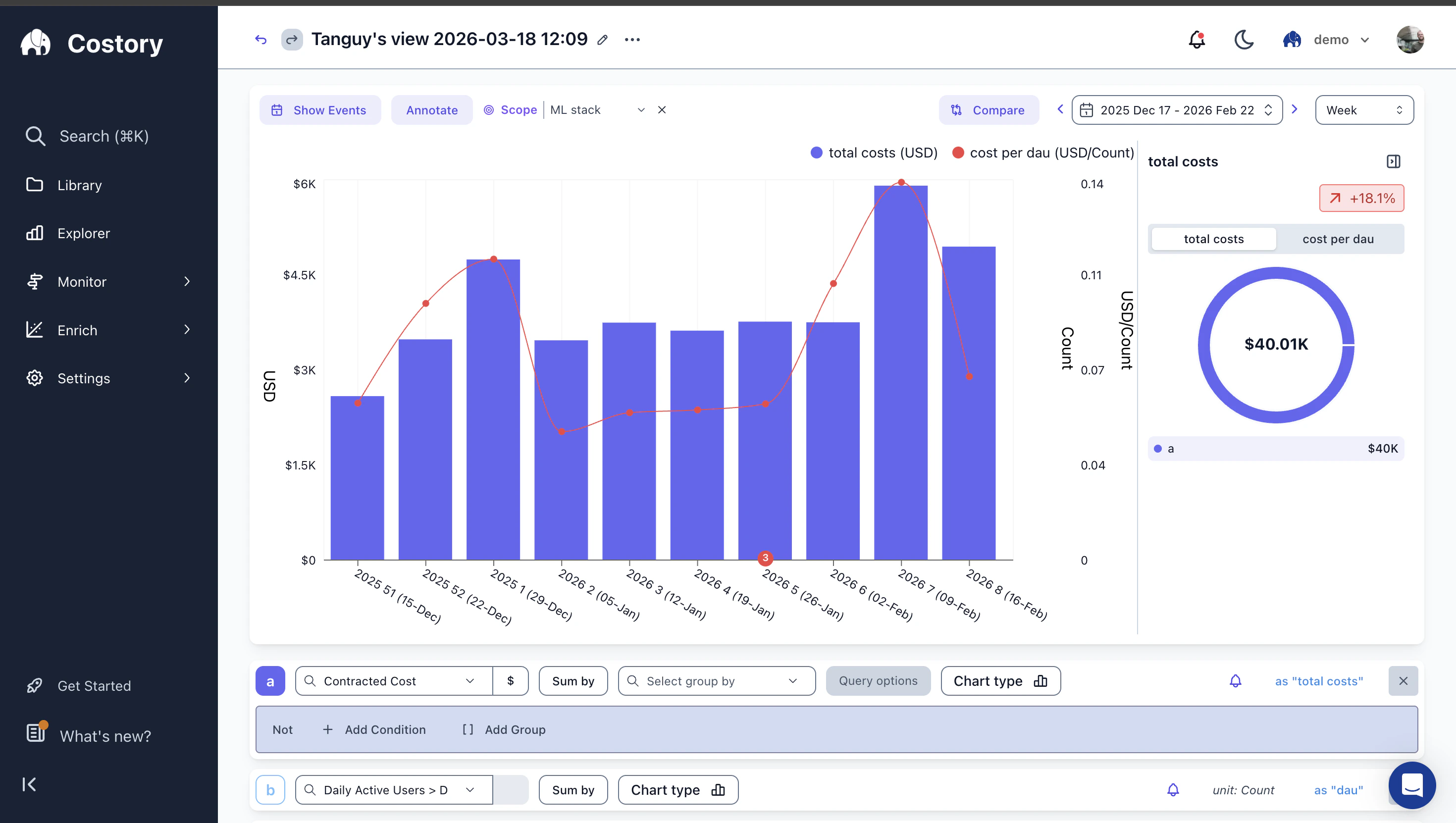
Save and share
Save the query so you can revisit it, export it to a dashboard, or schedule it as a report.
Frequently Asked Questions
How do I track cloud cost per user or per transaction?
How do I track cloud cost per user or per transaction?
Connect your usage metrics (e.g., DAU from Amplitude, transactions from your database) and create a formula that divides cloud spend by your usage metric. See the Cost Per Active User guide for a step-by-step example. You can apply the same approach to BigQuery costs with dbt or shared database costs.
Can I correlate cloud cost changes with deployments?
Can I correlate cloud cost changes with deployments?
Are cloud provider events detected automatically?
Are cloud provider events detected automatically?
Yes. Events like Savings Plan purchases, CUD activations, and marketplace renewals are extracted from your billing data automatically. No additional setup is needed beyond connecting your cloud provider.
What operators and functions can I use in formulas?
What operators and functions can I use in formulas?
Formulas support arithmetic operators (
+, -, *, /) and parentheses for grouping. Each metric is referenced by its letter label (a, b, c…). Currently, formulas operate on the aggregated value per time bucket. There are no built-in functions like min, max, or percentile, and no conditional logic. If you need rolling averages or more complex transformations, pre-aggregate in your external metric source (e.g., Datadog or BigQuery) before importing into Costory.Do formulas work with group-by dimensions?
Do formulas work with group-by dimensions?
Yes. If you group by a dimension (e.g., team or service), the formula is applied per group. This lets you compare unit economics across teams, services, or any other dimension.
How fresh is the data? How far back can I query?
How fresh is the data? How far back can I query?
Costory processes your cloud billing data daily, typically within 24 hours of your cloud provider publishing it. You can query as far back as your billing export history goes. If you configured your CUR or billing export 18 months ago, you have 18 months of data. Multi-account setups and consolidated billing are fully supported. For details on connecting your cloud provider, see the setup guides.
How is this different from my existing dashboards?
How is this different from my existing dashboards?
| Capability | AWS Console / CloudWatch | Grafana + Cost plugins | Costory |
|---|---|---|---|
| Actual billing data (CUR/export) | ✅ (Cost Explorer) | ⚠️ Requires custom ETL | ✅ Native |
| Deploy / PR event overlay | ❌ | ⚠️ Manual annotations | ✅ Automatic from GitHub |
| Cost allocation by team/service | ⚠️ Tags only | ❌ | ✅ Tags + virtual dimensions |
| Unit economics (cost ÷ business metric) | ❌ | ⚠️ Custom queries | ✅ Built-in formula editor |
| Shareable saved views with context | ❌ | ⚠️ Dashboard links | ✅ One-click share with events attached |
Next Steps
Cost Explorer
Build the base queries for your analysis
Quick Share
Save views, export to dashboards, and share with your team
Cost Per Active User
Step-by-step guide to tracking cost per DAU with Amplitude
Unit Economics Use Case
Advanced formulas and reporting workflows
Event Correlation Use Case
Full walkthrough of using events to explain cost changes
Digest
Auto-triage cost anomalies with AI-generated summaries